Getting full transparency throughout your DevOps process
DevOps is one of those terms, which is interpreted differently across our profession. Sometimes as a set of tools used for deployment automation, sometimes as the two guys in the basement, who administer our Kubernetes cluster. Much too often, we can observe the same pattern, as we did - and still do - with Agile: Using new terms while doing old things. Which leads to both, not gaining the benefits of the new approach, while keeping the known drawbacks from the old one.
As it was for Agile, DevOps should much rather be seen as a holistic approach, which only unleashes its full potential when its underlying ideas, principals, and mindset are understood and applied in our daily work1. So I rather consider DevOps a consequent evolution of Agile: Empowering self-responsible teams to creating products in a customer-centric way. By eliminating time-consuming hand-overs or endless review processes before the first release to production. That is done leveraging a shift-left approach. Shift-left describes shifting both, responsibility and empowerment from the right side of a traditional software development workflow - manual user acceptance testing, security audits, deployment, monitoring, user-behavior analytics - to the left: an empowered development team, having proper skills to embed all those steps within its regular software development process.
Principal DevOps metrics
One of the key principles behind DevOps is bridging the gap between development and production. Increasing transparency across all stages of your product- and software development lifecycle can vastly help to build these bridges.
This article concentrates on showing how to integrate metrics, which cover that whole lifecycle on one central dashboard, every team member has easy access to. This might be by having it on a big screen on the way to the coffee machine.
The most central abstract DevOps metrics are the Delivery Lead Time, Deployment Frequency, Mean Time to Repair (MTTR), and Change Fail Rate (rep2, hdb3, acc4).
These Metrics are reflected and/or influenced by several other metrics.
One example would be open merge- or pull requests, which influence the first three of them.
The same would be for the time you need to fully build and deploy your product (end-to-end time of your CI/CD pipeline).
Whereas plenty of other metrics, which concentrate on your code’s quality, are likely to correlate to your Change Fail Rate.
The following overview depicts the whole lifecycle, we are talking about. This article is about creating a central dashboard, which shows key metrics from all of these stages. Helping to improve the high-level overall DevOps metrics, described above.
I am going to write some further articles, each covering some topics from this overview.
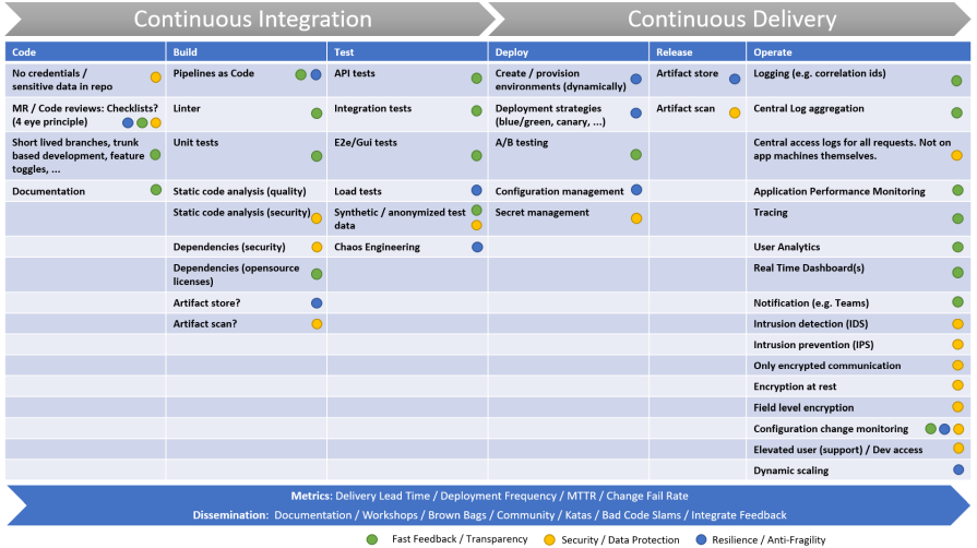 Systematic presentation of all stages throughout the software development lifecycle. From writing code to running it in production.
One Dashboard for the whole cycle
Our dashboard combines data from these areas and sources:
- Open Merge Requests (
GitLab) - Software metrics: Code Quality and SAST (
SonarQube) - Status (and duration) of build pipelines for multiple repos (
GitLab) - Product version, which is deployed to any environment (
custom API) - Estimated duration of a job queue (
Jenkins) - Status and health of an Elasticsearch cluster (
Elasticsearch) - APM: Requests per minute, Apdex score, Error rate, … (
NewRelic) - Analytics: Active users (also divided by instance / tenant) (
NewRelic)
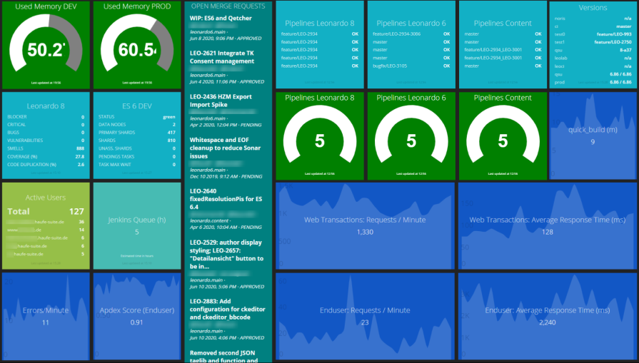 The complete dashboard.
All elements on the dashboard aim at creating transparency about the key stages across the whole product lifecycle. The overview of open merge requests, for instance, shall encourage developers to tackle them. Since code, which waits in this phase, does not add any value to our customers.
The software metrics, including potential vulnerabilities, help to identify issues at the earliest stage possible. Since the earlier an issue is spotted, the quicker and cheaper it can be handled (as opposed to having QA, or worse, the customer find and report it). So these metrics shorten the feedback cycle.
Development
Instead of focusing on reducing the MTBF (Mean Time between Failures) by extensive up-front testing and lengthy review processes, modern software development rather tends to focus on minimizing the MTTR (Mean Time to Repair). No matter how well your (manual) tests are, eventually your software will fail. Especially since not all of the real-world scenarios can be simulated during tests. So it might be wiser to “prepare for the worst” instead of “hoping for the best“5.
Being able to quickly respond to errors in production is the most valuable asset. To address this, we visualize several metrics concerning our build pipelines: what is their success rate (reliability), how long do they take (speed) and how is that speed evolving over time (to prevent losing speed without noticing it).
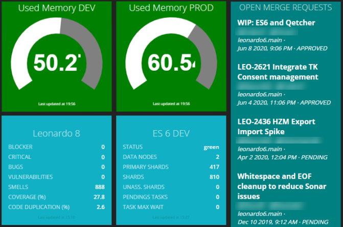 Development related figures: Software metrics coming from static code analysis, open merge requests and memory consumption of our Kubernetes clusters, where most of our build pipelines run into.
Build
Having several services running and aiming at a high deployment rate increases the need to know which version of your services are running at a given time. For that, we added a widget, which displays the currently deployed version across all our services and stages.
After covering delivering new value as reliably and quickly as possible, you are interested in two things: first, is it working as expected and has no negative side effects on your application and, second, do your customer like it.
To address these two questions, we added visualizations for response times and error rates. Allowing to quickly react, before any customer needs to pick up the phone to call the help desk. Besides, we added some analytics to see the number of users currently using the application.
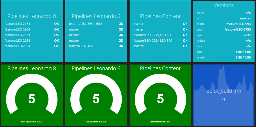 Success rates of the last five builds and build duration over time. The color changes to yellow or red if certain thresholds are met.
Operation
By the way, this also helps to visualize the impact we as a DevOps team have. We see actual users using what we have built. And we see how that affects response times and error rates. Opposed to implementing a feature, then having it to pass through several stages, including manual QA, eventually being deployed by the ops department. The next time we hear from it might be when pulling some associated bug ticket from the backlog some weeks later.
Allowing developers to have impact and making this impact transparent, thus, is a great means to boost the team’s satisfaction and motivation. And there, the cycle closes. Since having a self-motivated and self-responsible team are the best preconditions to build great software.
 This part of the dashboard covers the application running in production: Number of users and requests, the Apdex Score and the error rate.
Our dashboard contains several views / pages. This comes in handy to prevent overloading a single page. The dashboard automatically switches between these pages after a defined period (e.g. every 30 seconds). We will see how this is implemented in the next section.
We used this mechanism in combination with the possibility to embed foreign Dashboards: We already had dashboards in various other tools, for instance Kibana. Whereas we also query data from the underlying Elastic Stack to show them in one of the shown widgets, it would not make sense to try to recreate all existing dashboards again. Instead, we are integrating them as they are.
This one shows several aggregations for our production logs: Number of messages grouped by level, within each level, we aggregate for the classes, the messages come from. This easily enables us to see which classes produce the most errors or warnings.
The date histogram quickly reveals unusual behavior, which helps us to react to possible issues before they hit the customers - or even better: react to warnings before they become problems at all.
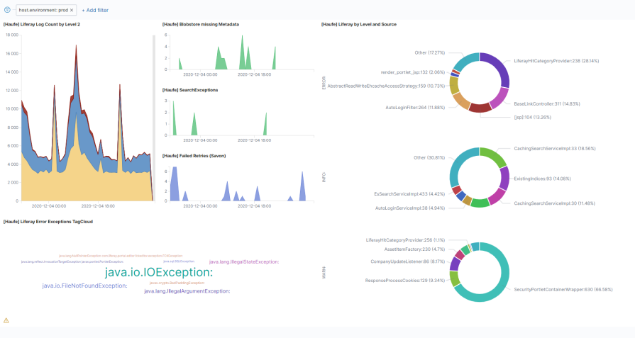 Integrated Kibana dashboard: Smashing has a special widget, which allows embedding iframes. Here we leverage this to embed a full-page Kibana dashboard.
Technical implementation
As mentioned, since these metrics refer to different areas of the product lifecycle, they typically need to be gathered from different systems.
So we were not looking for a holistic monitoring solution, which contains all needed data (like e.g. Prometheus/Grafana), but a dashboard, which can integrate data from different services and present them in a holistic view. Without permanently storing these data itself. This allows having an almost stateless tool, where we do not need to bother providing and maintaining some persistence solution.
The dashboard we ended up with, is Smashing, the successor of the no longer maintained Dashing (thanks to Thomas Doerr, who introduced me to Dashing a while ago).
Smashing allows placing widgets on a board, which fetch their data from arbitrary sources but presenting them in a unified way and a unified layout. There is a whole bunch of widgets available to fetch data from certain services (e.g. GitLab, GitHub, Google Analytics, NewRelic, Jira, …). Nevertheless, it is quite easy to write widgets to present data from any service, which provides some kind of API access.
Connecting a custom source
Connecting to a custom data source is quite easy. Dashing/Smashing uses so-called Jobs to periodically fetch data from various sources and display the metrics on the board.
These Jobs are Ruby files and are located within your dashboard’s jobs subfolder.
The relevant parts of our job, which fetches data from SonarQube looks like this:
Since we have different jobs for different repositories / applications, we extracted some commonly used methods into sonar_methods.rb.
These methods are included in our actual job:
require_relative 'sonar_methods'
Afterward, we read some configuration parameters from the job’s configuration sonar.cfg. For instance, the SonarQube server URL, the widget’s id, where we will show the results and the interval in which the data gets refreshed.
# Load configuration file
config_path = File.expand_path(File.join(File.dirname(__FILE__), "sonar.cfg"))
configuration = Hash[File.read(config_path).scan(/(\S+)\s*=\s*"([^"]+)/)]

# Read parameters
server = "#{configuration['server']}".strip
id = "#{configuration['widget_id']}".strip
interval = "#{configuration['interval']}".strip
# ...
Sensitive configuration parameters like credentials are read from the environment resp. a local .env file to not have them checked into source control:
unless ENV['SONARQUBE_ACCESS_TOKEN']
    abort("MISSING SONARQUBE_ACCESS_TOKEN variable (check your .env file)!")
end

accessToken = ENV['SONARQUBE_ACCESS_TOKEN'].strip
TIP: In an upcoming blog post, I am going to show how to keep Secrets-as-Code, having them properly encrypted using SOPS.
The job gets executed within the Scheduler:
SCHEDULER.every interval, :first_in => 0 do |job|

    # Get data
    data = getIssueCountBySeverities(server, accessToken, groupId, artifactId, severities)
    data.concat(getFurtherMetrics(server, accessToken, groupId, artifactId))

    # Pass the retrieved data to a widget on the dashboard
    send_event(id, { items: data })
end
The send_event publishes the data to the widget, referenced by its id.
That’s all related to the general setup, scheduling, and execution of the job.
How to fetch the data from the corresponding services differs according to their APIs. Here are the methods we use to fetch data from SonarQube (the included sonar_methods.rb):
require 'net/http'
require 'json'
require 'openssl'
require 'uri'

@metricLabels = {
    "bugs" => "BUGS",
    "vulnerabilities" => "VULNERABILITIES",
    "code_smells" => "SMELLS",
    "coverage" => "COVERAGE (%)",
    "duplicated_lines_density" => "CODE DUPLICATION (%)"
}

def getIssueCountBySeverities(baseUri, accessToken, groupId, artifactId, severities)

    issuesBaseUri = "#{baseUri}/api/issues/search?componentKeys=#{groupId}%3A#{artifactId}&statuses=OPEN&severities="

    severitiesArray = severities.split(',')
    data = []

    severitiesArray.each do |severity|
        uri = URI(issuesBaseUri + severity)
        req = Net::HTTP::Get.new uri.request_uri
        req.basic_auth accessToken, ""
        res = Net::HTTP.start(uri.host, uri.port, :use_ssl => uri.scheme == 'https', :verify_mode => OpenSSL::SSL::VERIFY_NONE) do |http|
            http.request(req)
        end
        data.push({:label => severity, :value => JSON[res.body]['total'] })
    end
    return data
end

def getFurtherMetrics(baseUri, accessToken, groupId, artifactId)

    uri = URI("#{baseUri}/api/measures/component_tree?component=#{groupId}%3A#{artifactId}&metricKeys=bugs,code_smells,coverage,vulnerabilities,duplicated_lines_density")
    req = Net::HTTP::Get.new uri.request_uri
    req.basic_auth accessToken, ""

    res = Net::HTTP.start(uri.host, uri.port, :use_ssl => uri.scheme == 'https', :verify_mode => OpenSSL::SSL::VERIFY_NONE) do |http|
        http.request(req)
    end

    metricData = {}
    data = []

    JSON[res.body]['baseComponent']['measures'].each do |metrics|
        metricData[metrics['metric']] = metrics['value']
    end

    @metricLabels.each do |key, label|
        data.push({:label => label, :value => metricData[key] })
    end

    return data
end
Embedding already rendered widgets
Besides the possibility to render widgets from source data, Smashing also allows integrating already rendered widgets. This is done using the data-view="Iframe". We are using this to embed a full page Kibana dashboard (using max values for data-sizex and data-sizey):
<div class="gridster">
  <ul>
    <li data-row="1" data-col="1" data-sizex="7" data-sizey="4">
      <div data-id="logs_grouped" data-view="Iframe" data-src="https://uri/app/kibana#/dashboard/baba891a-b0a9-11ey-879b-7de326663eab?embed=true"></div>
    </li>
  </ul>
</div>
TIP: The embed=true URL parameter leads to hiding unnecessary control elements, like the search bar. So it automatically opens it in full-screen mode.
Automatically browse through several dashboards
As shown above, one quickly has more meters than fit on one screen. To keep your dashboards neat and clear - allowing spotting the most important elements at first glance - you can consider splitting the meters to various dashboards.
There is a plugin for Smashing, which automatically browses through a defined list of dashboards in a defined period.
Having the plugin installed and configured, you can start the browsing mode by appending /_cylce to your dashboard’s URL. The period can be passed via an URL parameter. This example would switch the board every 30 seconds:
https://your.dashboard:3030/_cycle?duration=30
Securing access
Depending on where you run the dashboard and which data it contains, you may want to restrict access to it.
That can be done i.e. via BasicAuth. Within Dashing’s configuration (config.ru) you’ll find a placeholder for it:
configure do

  # [...]

  helpers do
    def protected!
      # Put any authentication code you want in here.
      # This method is run before accessing any resource.
    end
  end
end
To activate BasicAuth, using credentials USER_NAME and USER_PASS from the environment, adjust it like this:
require 'dashing-contrib'
require 'dashing'

DashingContrib.configure do

  # [...]

  helpers do
    def protected!
      unless authorized?
        response['WWW-Authenticate'] = %(Basic realm="Restricted Area")
        throw(:halt, [401, "Not authorized\n"])
      end
    end

    def authorized?
      @auth ||=  Rack::Auth::Basic::Request.new(request.env)
      @auth.provided? && @auth.basic? && @auth.credentials && @auth.credentials == [ENV['USER_NAME'].strip, ENV['USER_PASS'].strip]
    end
  end

end
Dockerize the Dashboard
Finally, we dockerized the dashboard. Allowing us to deploy it to a local workstation, which is attached to a big screen, or to deploy it to some cloud service - which for sure is needed if you have distributed teams. Or, like these days, home-office becomes more important.
Make technology and culture reinforce each other
Making the complete software development lifecycle transparent to the whole team brings a lot of benefits. Besides spotting possible bottlenecks, quality-, security- or performance issues, it shows the team the impact it has.
That’s a great way of supporting a team’s satisfaction, self-awareness and self-responsibility.
By that, technology helps to support the culture, whereas culture leads to improved technology. This mutually reinforcing cycle is the best basis for building great software.
Endnotes and Literature
1: Aiming in that direction, Jez Humble, author of Continuous Delivery (2010), felt the urge starting to work on a DevOps Manifesto, which stresses DevOps to be rather a “philosophy” and a “cultural, professional movement with attitude and values” rather than “a role, a set of tools” or “a prescriptive process”.
2: rep: State of DevOps Report
3: hdb: Gene Kim, Patrick Debois, Jez Humble, John Willes: The DevOps Handbook: How to Create World-Class Agility, Reliability, and Security in Technology Organizations, 2016.
4: acc: Gene Kim, Jez Humble, Nicole Forsgren: Accelerate. The Science of Lean Software and DevOps. Building and Scaling High Performing Technology Organizations, 2018.
5: elev: Gregor Hohpe: The Software Architect Elevator: Redefining the Architect’s Role in the Digital Enterprise, 2020.